Getting a close button to hang off of a dialog

Have you ever had to implement a modal dialog with a close button designed to hang off of the corner?

While not a huge lift for most developers, there’s a few steps involved. It also requires extra care to avoid accessibility gotchas. I did this recently and wondered if there was a simpler approach using modern CSS.
The problem #
This post isn’t about how to implement a <dialog>, so I’m not going to get into any of that. Just note that for simplicity I’m using the new Invoker Commands API in the demos, so you’ll need to view those in a supported browser.
Say there's a <dialog> that has a close button with some CSS positioning:
html snippet: Markup for a dialog with a close button and content
html<dialog ...> <button class="dialog__close">[...]</button> <h1>My short dialog</h1> <p>Lorem ipsum...</p> </dialog>
css snippet: CSS of a class ".dialog__close"
css.dialog__close { [...] position: absolute; top: 0; right: 0; transform: translate(50%,-50%); }
The CSS absolute positions the <button> in the top-right corner, with the transform bumping it up and over a bit more, creating the hanging effect. Or at least that’s what you might think:
See the Pen Dialog with overlapping close button 1 by Darin (@dsenneff) on CodePen.
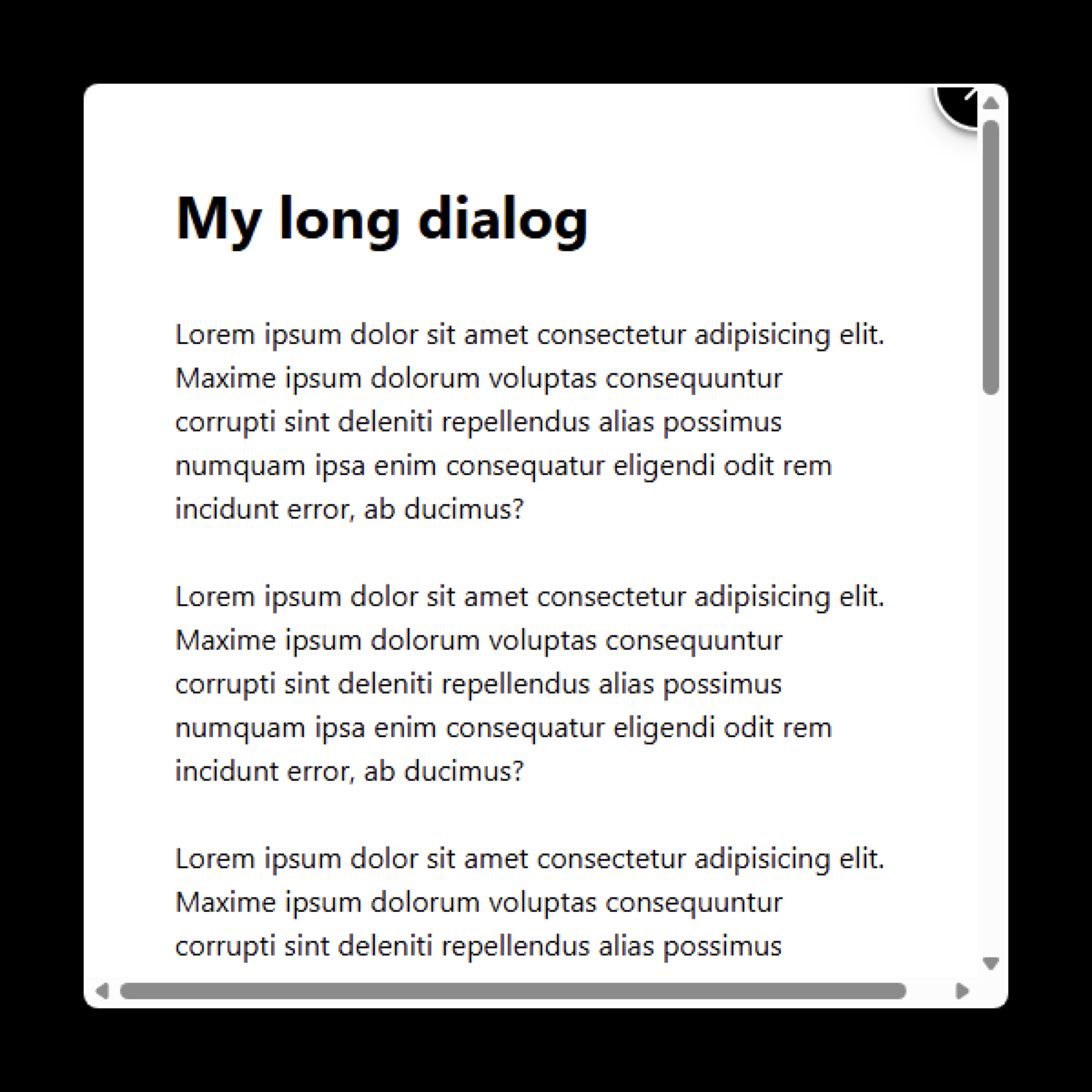
The <button> ends up being clipped due to the <dialog> element’s default overflow: auto styling.
The common approach #
Most developers work around this with some form of the following approach.
First a wrapper <div> with tabindex, role, and aria-labelledby attributes is added around the <dialog>'s content. It’s also given an overflow CSS value.
html snippet: HTML for the dialog with a div wrapping its content
html<dialog ...> <button class="dialog__close">[...]</button> <div class="dialog__content" tabindex="0" role="region" aria-labelledby="shortDialogLabel"> <h1 id="shortDialogLabel">My short dialog</h1> <p>Lorem ipsum...</p> </div> </dialog>
css snippet: CSS for the .dialog__content class with overflow: auto
css.dialog__content { overflow: auto; }
This creates a scrollable content area that’s keyboard-operable, plus information for screen reader users to figure out what it is. Steve Faulkner’s note on scrollable regions explains this technique a bit more if you’re curious.
Next, we add the following styles to the <dialog>:
css snippet: CSS for the dialog with overflow and grid properties
cssdialog[open] { overflow: visible; display: grid; grid-template-rows: 1fr; }
overflow: visible prevents the <dialog> from scrolling, since it now has a scrollable <div> inside it. It also now allows the overhanging parts of the <button> to remain visible.
The grid properties simply regulate the content <div>'s height so that its overflow: auto kicks in and scrolls as needed.

See the Pen Dialog with overlapping close button 2 by Darin (@dsenneff) on CodePen.
The hanging close button is now fully visible. And if the <dialog>'s content is long enough, the <div> inside becomes scrollable.
This works fine enough, but does feel a bit unnecessarily complex just to get a button to look a certain way. Plus, if a developer skips certain steps it can have an accessibility impact.
A new approach? #
I wondered if there was a simpler approach using modern features, with the added benefit of it being a tad more usability foolproof.
I posted the question on Mastodon, where Roma Komarov pointed out that you could likely pull the hanging button effect off with CSS Anchor Positioning, since anchor-positioned elements can escape a parent’s overflow. So I gave it a shot.
First, the <dialog> reverts back to the original markup with no wrapper <div>:
html snippet: HTML for a dialog with a close button and content
html<dialog ...> <button class="dialog__close">[...]</button> <h1>My short dialog</h1> <p>Lorem ipsum...</p> </dialog>
It’s then declared as an anchor with the anchor-name property:
css snippet: CSS for a dialog with the anchor-name property
cssdialog { [...] anchor-name: --my-anchor; }
Now, the close button gets a few properties:
css snippet: CSS for the .dialog__close class using anchor positioning
css.dialog__close { [...] position: fixed; position-anchor: --my-anchor; top: calc(anchor(start) - 1.5rem); right: calc(anchor(end) - 1.5rem); }
position-anchor: --my-anchor associates the <button> with the previously-declared anchor (the <dialog>) for positioning.
The top and right values use the anchor() function to place the <button> at the <dialog>'s top-right corner, plus another 1.5rem in both directions to hang it off the edges.
Since the browser renders the anchored <button> in a different layer, it appears fully visible without any clipping or scrolling.
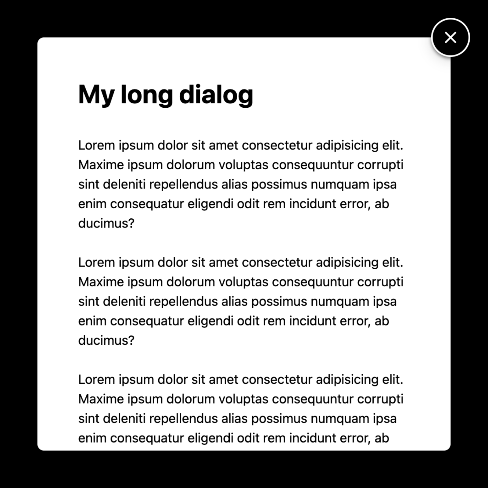
See the Pen Dialog with overlapping close button 3 by Darin (@dsenneff) on CodePen.
And because the <dialog> is scrollable and keyboard accessible by default, longer content is still reachable without any additional work.
This approach works and seems a lot cleaner and simpler to me. However, there’s one small issue to deal with.
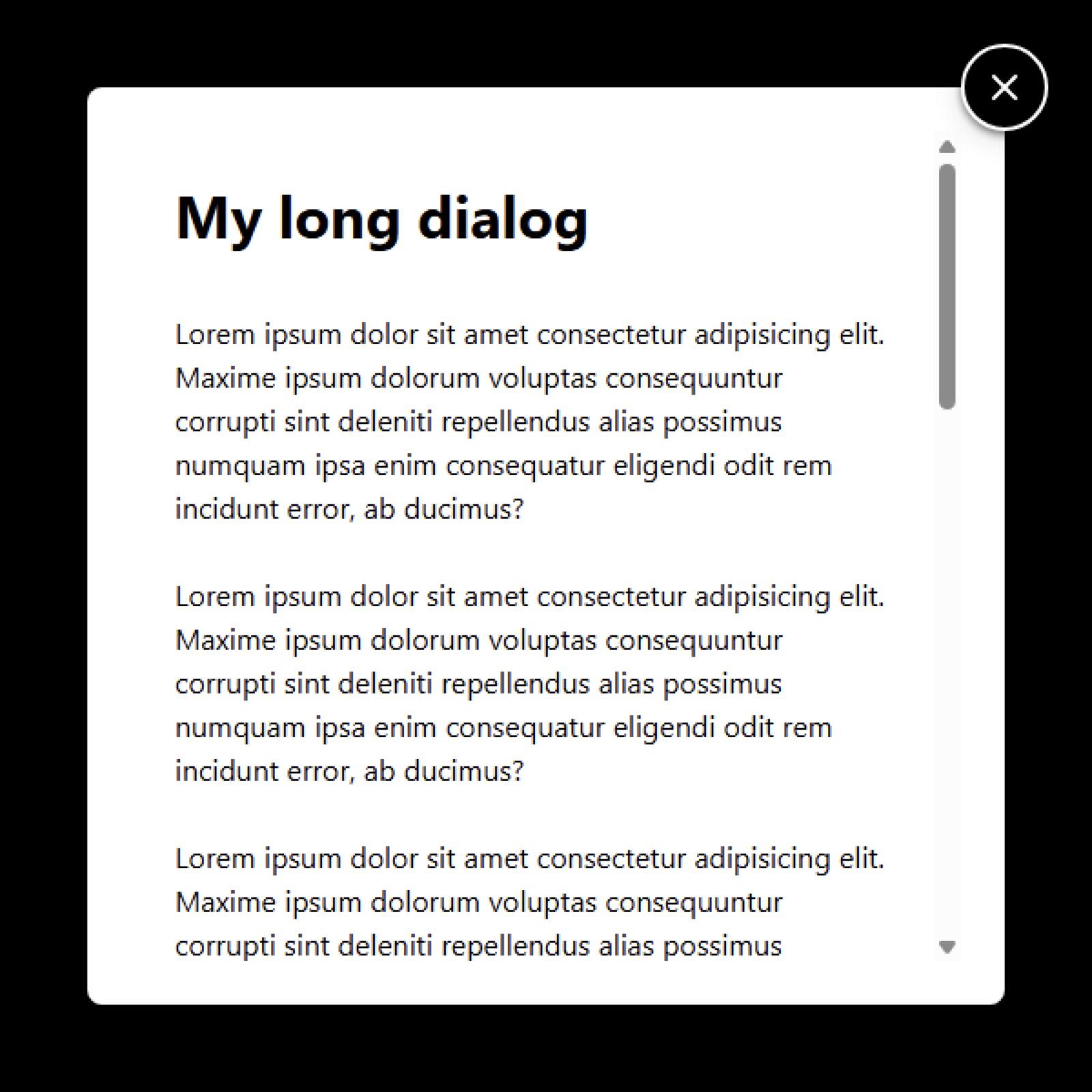
Working around a minor issue #
When content is long enough to need a scrollbar, the top of the scrollbar will appear visually underneath the close button.

Depending on the platform’s scrollbars, up to 25% of this 48px round close button can overlap with the scrollbar. Clicking the overlapping area in some browsers activated the scrollbar, while in others it activated the button. Regardless, it’s a usability issue that needs addressing.
Note that the <dialog> has been using 3rem of padding for spacing between its inner edges and content.
css snippet: CSS for a dialog with padding
cssdialog { [...] padding: 3rem; }
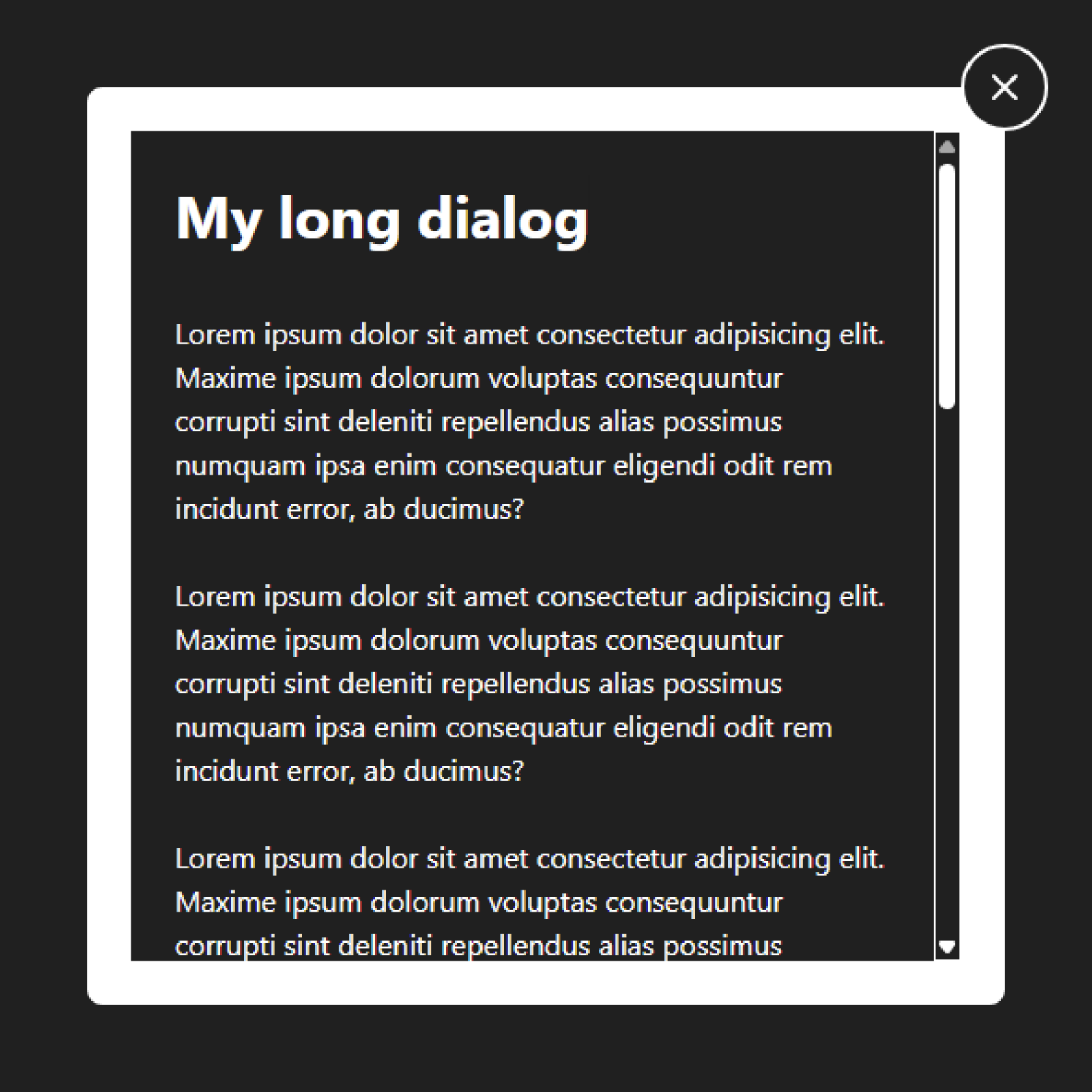
I’m going to reduce that in half, down to 1.5rem, and then add a transparent border of 1.5rem.
css snippet: CSS for a dialog with a border and padding properties
cssdialog { [...] border: solid 1.5rem transparent; padding: 1.5rem; }
Scrollbars get rendered inside of a container’s borders. So using the thickness of the border for spacing inside of the <dialog> will bump the scrollbar in and away from underneath the close button. And because the border is transparent, everything looks the same as before:
See the Pen Dialog with overlapping close button 4 by Darin (@dsenneff) on CodePen.
The exact values to use will depend on the size of the close button and amount of inside spacing desired.
Also be aware that the thick transparent border could become visible if the user enables any sort of high contrast mode. Here’s how it looks in Windows Contrast Themes’ “Aquatic” theme:
Conclusion #
The anchor positioning approach seems a lot simpler and cleaner. There’s no unsetting the <dialog>'s default overflow behavior. No need to add a scrollable <div>. No risk of developers skipping the HTML and ARIA attributes that ensure it’s usable. I like the idea of there being less things to potentially break, so in that sense it feels a bit more foolproof.
I wouldn’t use this in production yet until anchor positioning gets better support, but it looks like a viable option for this design constraint.
But maybe there’s something I’m missing? Do you see any downsides? Feel free to ping me on Mastodon or Bluesky with your thoughts.